Friday, 11 October 2013
Visual art style
The art style we're aiming for in game is basic block colours with cell shaded look. The main inspiration for the art style comes from windwaker.
Tasks for next week
All
- Ideas for game name and company name
Darren
- Monster concepts adhering to visual target
- Begin creation of proxy mesh for mech character
Lara
- Mech concepts adhering to visual target
- Begin creation of proxy mesh for monster character
Matt
- Digital designs for GUI
- Look into viability of implementing the GUI e.g. scaleform, Unity GUI
Oliver
- 3x3 Environment concepts
- Paint over for mechs and monsters
- First draft of background story for game
Rich
- Start implementing path finding and collision for unit movement on prefab objects
- Finish implementation of unit creation from buildings
- Look at how to improve the camera system e.g. having a battle camera
Final designs for melee and light mechs(darren)
Here is a quick post showing the 6 variations each for the melee and light mechs with the heavy mech designs almost done and colour variations following this weekend.
Rough UI designs
A. Instead of having labelled buttons, images. Might work, e.g. The Mayan Pyramid might launch the game, mech being Options.
B. the pattern on the bottom could scroll to the right, the triangles were inspired from patterns that the Mayans used to create.
C. Similar to image A but I've used patterns. The sun logo is a iconic image the Mayans worshipped to.
D. Again a Mayan pattern, simple design but easily read.
What next??
- More templates will be created on PC so I can experiment with colours, concentrating on pastel colours to go with our art style.
- Typography will also be important I will be looking into that as well, I'll be looking for a fun and easily read words.
- Also learning on how to create the UI in unity.
Form and Body Markings :Lara:
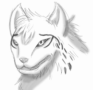
Since the fur colour resembles sand and the body form changed a little, the monster character began to resemble a hyena rather than a wolf. I also designed the tail a little shorter because it is gonna be easier to animate. I left horns away completely for now since it is probably gonna be in the way of any head armour it might wear.
UI rough designs.
A. This is just a very simple idea, you'd usually see a interface like this in touch based menus.
B. For this design I looked as Aztec patterns. They use a lot of triangles so I thought I'll test it out.
C. This again is very simple. I'd like to a panoramic image our level in the background if we would use this design.
D. Anther Aztec themed menu, the gird like boxes in this pattern is quite common.
variations of light/melee and heavy mechs and head designs (darren)
Here is a quick post showing some of the final stages of exploration for the mech classes. Using a simple process of combining pieces of other designs I was able to generate these designs much more quickly and once again giving these new designs a level of connect ability with each other. The process of giving them a more cell shaded look has proven more difficult in certain areas but when it comes to producing colour passess for these and the last few experiments with the last body type I'm working on currently I hope to have the effect more understood.
Unity - Core Game mechanics
Unit movement mechanics
- Basic movement for any worldObject with unit class script attached
Selection of units and buildings
- Raycasting used to detect if mesh collider is clicked on by the cursor
- Name of unit or building displayed in GUI
Camera Controls
- Camera pans when mouse reaches edge of screen, the extents of this can be defined in the resource manager
- Camera can rotate with RMB when left alt is held down
- The scroll and rotate speed and amount can be defined in ResourceManager script and can be later hooked up to a options menu GUI
Level design - 2D map and rough blockouts
Rough block out with buildings
- Rough building block outs help establish the scale of game world objects
- Allows for environment artist to paint over and give an idea of end product
Basic blockout in Unity
- Defines the basic shapes and path ways of the level
Rough 2D layout of the level
- Players will be dragged to capture points(CP) to gain resources for units
- Flanking ramps by CPs that are closer to each base means brings importance for the middle as well
- Middle also offers quickest route to enemy base
Thursday, 10 October 2013
Wednesday, 9 October 2013
further light/heavy mech designs and colour passes (darren)
Here is a quick post outlining the progress of the light/heavy mech classes today. By combining elements from previous designs that I produced for the melee class of mechs I was able to begin generating ideas for the other two mech classes faster but also connecting each of the classes so they looked like they came from a consistent universe. Now while not much progress was made today I do plan to generate far more designs tomorrow now that I confidently feel I dont need to explore any other ideas in terms of mech design. So tomorrows will be to simply combine a load of ideas together from the ones I have explored and create a variety of colour passes for each. Below are those that I produced today with one still in progress.
light/heavy class idea and colour passes(darren)
Below is a quick post outlining a design I created mixed with other ideas I had previously explored to generate a variant for the light or heavy mech classes. The aim being to explore a more ostrich leg set up aswell as cannons for arms to differentiate the class from the melee one.
Tuesday, 8 October 2013
Monster Wolf Head shapes :Lara:
I personally prefer the very right one. It seems like an equal balance of the other two headshapes and looks most canine like.
Monday, 7 October 2013
Sunday, 6 October 2013
Creature and mech designs progress (darren)
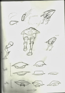
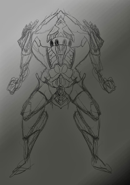
Here is a quick post to collect all the designs I explored mainly over the summer holidays and some in the first week of the project year. Some are still in progress with the aim being to be complete by the end of the coming week.
Subscribe to:
Comments (Atom)


